The Logo Design Process: What To Expect When Developing Your Logo
A logo is often considered the visual identity of a company – and most companies will have one. From a marketing perspective, the logo is a critical cornerstone of branding as a whole; it’s a dynamic face for a faceless company.
Contents
Logos: Deceptively Difficult
The Nike swoosh, is just a swoosh, Apple’s apple is merely an apple someone bit, and McDonalds owns those golden arches which have been burned into our brains forevermore.
All these brands are mega-buck billion dollar companies, and their simple logos have become iconic. So much so that just by seeing them, they swirl up the same responses from consumers worldwide: Swoosh? Running shoes. Apple? iPhones. Golden arches? Suddenly, I have a severe hankering for fries.
Creating a strong association between a logo and a product through design is a marketer’s dream. When you’re logo is that good, it starts doing the marketing for you. It’s rarely a coincidence when logos make big impacts. When they do, you can be next to certain that someone spent hours refining and obsessing over each and every element. I’ve seen it firsthand in our office, it seems… stressful.
However, the simplest things are often the most challenging. Unless you’re a branding or design nerd, you rarely consider the amount of hours, thought, brainstorming, light crying, and strategy that were integral to the final product.
While you may not have a billion dollar company hucking out French fries and/or fancy phones, the same design principles and rules should still apply to your logo. Plus, when working with an agency, you should know what to expect.
The Rules of Creating an Iconic Logo
Will It Scale?
I watched this video once that gave great tips on things you can say during meetings to sound smart, my favourite being “Will it scale?” When applied to logos, it makes perfect sense. A logo should look equally great on a business card or a billboard. Spacing, typography, and some unique visual element contribute to an iconic logo. It should draw you in whether big or small. Size matters, you guys.
Keep It Simple, AF!
When a logo has too much going on, you’re challenging your audience to absorb more than they need to. It can be difficult to let go of design elements you’re attached to, but as the logo is refined further and further until only it’s foundation remains – you’re more likely to have a memorable logo. Keeping it clean allows your audience to remember you. Clean up the clutter and create enough space, so if your logo is seen – even for just a few seconds – people will be more likely to draw it from memory. Get inside their brains… in a non-creepy way.
Capture Your Brand
With our clients, we often ask them a long series of questions before we ever develop a logo for them. Since your logo directly relates to how the public perceives your brand, you’ve got to know who you are and what you want people to takeaway from your brand. Are you fun (curvy rounded type, playful colours), or are you serious (Serif fonts, strong lines)? Are you a professional service or are you a lifestyle brand? Your logo should be aligned with your brand identity, and your brand story. Designers take this information about you and use it to develop your logo, so know who you are and don’t focus on what you want to be.
Starting Points: Getting to Know You
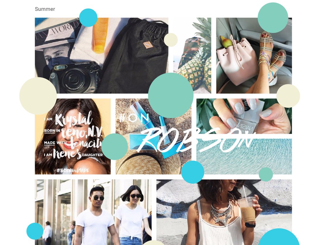
Image: Robson Street Business Association Case Study
Feeling all set and ready for your very own iconic logo?
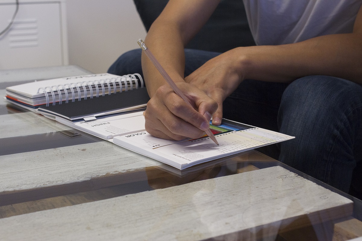
You may have some ideas about how you envision your logo and branding. Maybe you’ve pulled out your pencil kit and done a few preliminary scribbles and sketches yourself. Or, perhaps you’ve asked your artistically inclined nephew to play around on Adobe Suite. As playful or pointless as these tactics might be, the more inspiration you bring to the design table – the better.
If a picture is worth a thousand words, describing what you want in a design is worth at least a thousand phrases. For many individuals, it can be hard to talk about the visual direction of your brand. What is modern to some is dated to others, the definition of ‘dynamic’ tends to differ from person to person. No one is expecting you to sit down and become immersed in design magazines and brush up on the latest brand buzzwords – let the brand designers worry about that ever-evolving lexicon.
The best means to communicate what you like is to pull inspiration from other brands that are embodying the vibe you’re after. Whether it’s their logo, a catch phrase, a colour combo, or a specific font – any detail offers insight into your . Whatever it is that lures your eye in, right click and save the image and start compiling your logo moodboard. This is an easy resource to pass to a graphic designer that will give them a good sense of the esthetic you’re going for, without ever needing to debate the definition of ‘dynamic’.
Here’s your friendly breakdown to get yourself started:
Step 1: Create Your Moodboard
Cruise the web on your digital surfboard and start pulling images, logos, colours – anything you like. Once you’ve compiled your moodboard images, start eliminating any of the references that don’t relate to your brand identity. Maybe you liked a graphic bouquet if tulips, but if tulips don’t have much to do with, for example, your hypothetical law firm, take it away. By the end of this exercise, you’ll have a great resource of where you’re heading.
And here’s a handy trick: consider using Adobe Express Free Logo Design Templates as part of your exploration. Adobe Express offers a treasure trove of templates that can spark your creativity and help fill out your moodboard. You can play around with different styles, colors, and design elements to see what resonates with you and your brand. It’s an easy, cost-free way to experiment with hundreds of editable ideas and start narrowing down what you truly like.
Step back from it for a day. Take a deep breath, enjoy a beverage of your choice, and come back to your moodboard once you’ve had enough time to see it with fresh eyes. On second glance, you’ll probably notice a couple things that don’t align with your vision. Take those ones out too.
By now, you’ve got yourself a solid moodboard.
Step 2: Context, Context, Context Until It Hurts
Context counts, we say it all the time within our own agency. While visuals are greatly helpful, the context behind every choice you made is where the real meat is. You’re going to have to ask yourself “Why?” a lot. Why did you like this? What about it is so appealing to you? How does it apply to your brand? Whether you like the curves of a font because it comes off as personable, or you like the firm lines and classic feel of a serif font, consider the reasons behind your decisions and choices.
Spend the time to really think about it, and jot the lot of it down. With all that sweet, sweet context, your graphic designer is empowered to take your inspirations, understand their significance, and apply this to your logo. As humans, we instantly know based on our gut if we do or don’t like something, but articulating why can be a challenge. Always challenge yourself to explore the reason behind it.
Feedback like, “I just don’t like it” doesn’t leave offer a lot of direction or places to go, whereas “I don’t like it because that font is just too abrasive,” indicates exactly what needs to be worked on.
The more you think about it, the better positioned your designer will be to create something that is perfectly on point to what you’re looking for.
Step 3: Sit Back and Let Go
Holy snack – if you’ve created your moodboard, considered your choices, and jotted down the context behind your choices.. Well, congratulations, you’re officially an agency’s dream client! You’ve done your homework, I would straight up high-five you.
You can relax now, knowing you’ve developed the valuable resources needed for a talented designer to turn your brand concepts into an iconic logo that is perfect for your brand. It’s time to hand over the reins and let the creative talent create a finished product.
It can be nerve racking handing over your ideas and quietly awaiting your logo concepts. Know you’ll always be in good hands with an experience professional. They’ll take the time to explain their approach, and how they incorporated your inspirations, thoughts, and values into your design. Best yet, you’ll be able to shape the final product through discussion and thoughtful feedback.
You can be as involved as you like, but be sure to express that in the Creative Process. Some folks like to hand off and let the designer take over, while others want to be closely involved. However, it’s good to keep in mind that you might be surprised at what happens next. Maybe the designer interpreted your ideas in a way you never thought. Stay open minded and consider the context of the design itself, as the designer did with yours.
Wrap It Up
You know what? We love working with clients to help their brand identity become a stunning logo that captures who they are.
While I’m no designer, I get a real kick out of working closely with the designers who create them. Seeing how some abstract direction can take shape into an iconic logo is a stunning process. But the whole process from start to finish is time consuming. When I discovered just how many hours go into it; the research, the concepting, the inspiration collecting, the infinite variations, and tiny tweaks to develop absolute perfection – well – it’s dizzying.
If you do your homework, and you play by the rules – the result will be a logo that will represent your brand for years to come. When someone passes it by, they’ll be able to make an assumption about your brand, so make it count.
If you want to learn more about overarching branding, it might be valuable to read The CMO’s Guide to Building Strong Brand Strategies.
If you want to learn more about specific key elements of an effective marketing plan, read our 50+ page booklet on How to Write A Strategic Marketing Plan That Yields ROI – complete with explanations
